Something about Alice
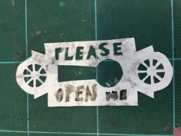
We are continuing to learn printmaking techniques at my Brisbane Institute of Art class. All of the public holidays have meant we have been slow to get started this term. (Still nice to have the public holidays for family time). We have made a start on creating masks for screen printing for the next part of the class. I am a bit of a perfectionist. I know, it is nice for handmade to look handmade and not mass-produced but I think I need some practice in using a craft knife ...
I decided to make masks using lock and key designs - something very Alice in Wonderland like and there is something about Alice that lends itself to a bit of creativity and madness. Well at least I think so. Hmmm, maybe I could make a few more masks with rabbits and cups of tea ...
Hopefully we will start to print with these masks on Monday. I need to see how everything fits together before I can really understand the technique and then begin to experiment with it.
Words to live by ...
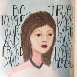
Continuing with my lessons in the Jane Davenport class, I am trying to add more words to my drawings. I have added a Thoreau quote this time rather than my own words. I think I would do the lettering differently next time but it's all part of the experimenting process. I used Jane's technique of painting a general head shape first and then back filling the features. I find that approach really relaxing ... so much fun to see who emerges from the initial background painting.
Words in her hair
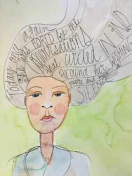
I am continuing to be inspired by the work of Jane Davenport and Joanne Sharpe as they co-teach the Miss Quoted class. Combining words and pictures is tricky - there is a fine balance needed - I find either my words or my picture gets in the way of the other. I'm sure that's fine but, hmmmm, it is definitely trickier than it looks. Throw some water color painting into the mix and the whole project become thoroughly enjoyable but quite often a hot mess too :-)
Still I think (I hope) persistence is the key. Something good must come from practice, right? Well that's at least what I tell my family. Guess I better do the same. (Although if I'm honest, I don't see it as practice as much as just a very enjoyable way to escape to my happy place).
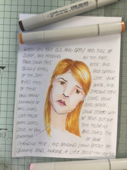
Copic pens and hand writing
More inspiration from the Jane Davenport and Joanne Sharpe "Miss Quoted" class ... this time I was inspired to play with my Copic pens and combine my drawing with some handwriting. The inspiration for the words? Well, that would be my favourite poem by Yeats, "When You are Old"...
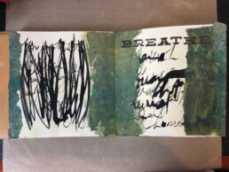
This month was ...
I am a little behind in some of the activity lessons for Wanderlust 2017, so it was wonderful to have a chance to get some painting and art journaling done this week. The prompt for the "Wanderlust Book" for 24 February was "this month was ... [insert 6 nouns]". I decided to think about the month of March as I created the page. My 6 nouns were ... hot, humid, busy, stressful, hopeful and harried. Lots of negative nouns - it was a tough month. So in a nod to those nouns, my page ended up being very messy, in colours I wouldn't normally gravitate to; olive green in particular is not one of my normal choices. Ultimately this is a page in an art journal and I'm OK with the mess. It truly does sum up my feelings towards March ...
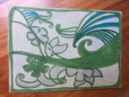
Swirls and flowers and carving lines
My Introduction to Printmaking class is on hold for the school holidays. So, I am using the down-time to do some lino carving and drypoint etching in preparation for next term. Some of my ideas and sketches might work ... and I suspect some of the others won't be quite so successful. Still practicing carving is a very pleasant way to spend an afternoon (particularly as I listen to an audiobook at the same time).
I have also been mulling over some ideas for collagraphs. Collagraphs definitely need some preparation time (and drying time) so I should make a start on those plates this week; ready for printing when class resumes.
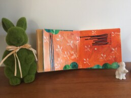
Shades of orange and vibrant green
I have been continuing to enjoy the video lessons offered by Wanderlust 2017. The week 10 lesson by Alena Hennessy was another great learning experience. I love Alena's work - she makes intuitive painting seem so effortless. I struggling to add as many layers to my page as Alena does. I am in awe of her ability to add and layer and add and layer again.
I have made a start on my page inspired by the week 10 class. It is still a work-in-progress. It could use quite a few more layers and depth but I do like the shades of orange and the vibrant green sharing the same space. I have an overwhelming urge to add a face to the page ... but for the moment the page remains as a primed background.
Eucalyptus oil meets musical notes
My mental health moment (ie my Monday morning art class) continues. Learning a new creative technique on a Monday morning has got to be just about the best way to start the week. After a crazy-busy weekend of kids' sport it was such a pleasure to be able to carve out some time for myself to learn.
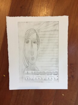
This week Nancy showed us ways of incorporating eucalyptus oil transfers into our mono prints. My initial transfer wasn't very complex - just some sheet music onto a drypoint I had been experimenting with. Still the idea is interesting. (Admittedly I did have to stop and think a few times about whether the transfer needed to be face up or down ... the opposite to chine colle is the key).
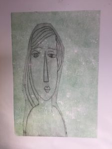
I did skip the transfer technique on my second print with the the drypoint girl - played with a layered mono print instead.
As always, a fantastic learning experience. Thanks Nancy! https://nancybrownstudio.wordpress.com
My second drypoint ...
Sad little creature
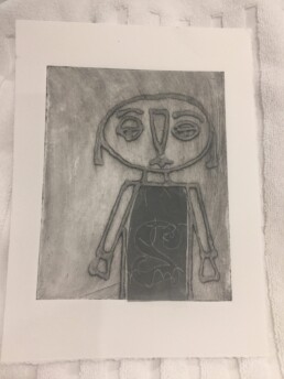
I wasn't sure about collagraph as a technique. I am not a huge fan of collage. I've tried it but there are just too many lumps and bumps for my liking. I can appreciate the ideas and and I often admire the finished work, but it is not for me. So when I was introduced to the idea of creating a print by first creating a collage I was hesitant. But in art there is always a way to put your own slant on something. In my case I decided to use gesso as my (one and only) collage material. And so my sad little creature was created.
His little shirt was a chine colle addition (using a scrap of the ghost print from my efforts at least week's class).
Hmm. I just need to carve out some time to do some more gesso-only collages and have some more fun with this technique.
Alphabet soup
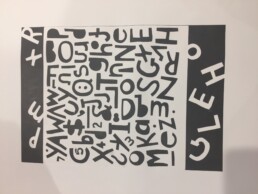
My adventures with printing continue - the focus with this piece was to discover how type (as a mask) could be used for a relief mono print. I like the print. It is big - around A2 in size. Quite striking with the black and white (I think so anyway).
Actually one of the really appealing parts of art for me is that my biggest decision in the case was whether to print in black or in purple. World-shaking decision, I know. Aaah, take me to my happy place!
