Enter Paynes Grey
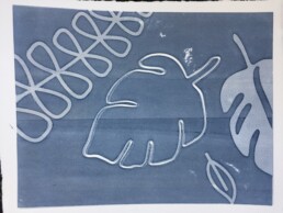
I have been alternating between black and white prints and art work made using very bright colours. Yesterday as I learned how to make marks using screen printing, I played in a middle-ground. Paynes Grey is a such a great colour. It can be dark and intense; it can be muted and faded. It proved to be a great colour for layering on my screen printing experiments. I didn't produce particularly good looking work but I was most definitely learning how to make marks using screen printing techniques ... and how to create layer on layer on the prints.
Not sure where this is headed
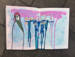
After a stint of black and white (mostly printmaking efforts) I felt the need to play with colour. This particular page is just a page of paint and an emerging girl. I am not entirely sure where I'm going with this. I don't have a plan and I don't want one. Sometimes it is so very nice just to put paint on the page and not be concerned with ideas and finished pages. Who knows, I may just cover the whole thing in gesso ... or not. :-)
Sometimes play is the best way to learn. (At the very least it is just pure fun).
And now a splash of colour
Inspiration comes from everywhere ... or at least that is how it is supposed to work. Sometimes I am on a roll and ideas just flow. Sometimes I have moments where I sit down to create ... and ... nothing. No creativity, no ideas, no inspiration, just nothing. Those moments are frustrating.
There is a quote from Pablo Picasso that I particularly like ... "Inspiration exists, but it has to find you working".
So true.
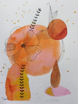
This painting is inspired by a similar painting I found on Pinterest. This one is definitely based on a style I liked and tried to emulate. It worked; finishing this painting and being surrounded by water colours, paint brushes, and ink definitely helped with my creative mojo. Thank you Pinterest! And thank you Cecile Hud for your work.
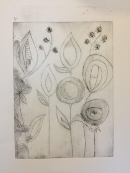
Drypoint flowers on the page
I keep coming back to drypoint as my favourite printing technique. I like the simplicity of the sketch and the ability to then add depth and texture with the ink. My little drypoint flowers could do with some colour but I was just wanting to see how it would print as a basic design.
I'm thinking a little bit of chine colle might be in order too ... I mean, how can you go wrong with a little bit of colourful collage highlighting the garden? Actually it would be interesting to print this in a number of different colour palettes and frame them alongside each other like a summer garden. Hmmm, yes now that would work.
Hmmm, I wonder ...
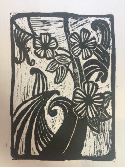
Last week I finally had a chance to print some of my linocuts. I first worked on my flowers and swirls lino back in April so it was nice to get a chance to print it.
I printed in black ink because I rather like the graphic look of a black print on white paper ... and that worked for some of my prints but not all. I'm thinking this flower and swirl print would look better in a bright colour. Hmmm, but as I give it some further thought I'm wondering whether this would be a good design to print in two colours ... perhaps as a reduction print with oranges and greens? I might go back and work a bit more on this. Aaah, such a lovely dilemma! Black, white, blue, green, orange ... the big decisions really.
Smile ... you're printed!
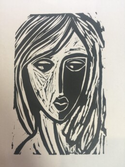
Quite a few weeks ago I spent some time carving lino ... faces and flowers and just general shapes. Such a very pleasant way to spent a lazy afternoon ... but until now the cut lino has just been stashed on my desk.
Pleasingly, I finally had a chance to do some printing yesterday. I used a clamp style press rather than the main printing press and I think it has printed better this way.
I am pleased with this face; she worked out better than I thought. It is only a small print but seeing her printed has given me the confidence to carve her again but perhaps on a bigger scale. I do so love creating faces ... more than nature images or abstracts.
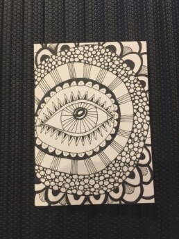
Eye lines
A black pen and a piece of paper ... no yoga for me. I find drawing and doodling and mark-making meditative. I know other people use yoga or sport or music as their centre, but for me, pen and paper please.
This was drawn on a small Artist Trading Card sized piece of paper - 6.5 x 9 cm. A perfect size to use for just a short amount of reflective time. Short but effective.
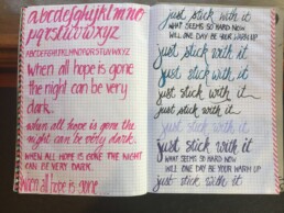
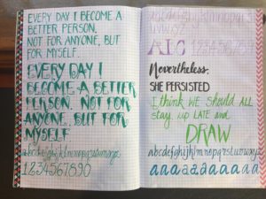
Practice, practice and more practice
A composition book and a copic pen is all it takes to practice my handwriting ... oh, and the determination to carve out some time to practice. Simple really. And yet, time has a miraculous way of evaporating.
I have found if I leave the composition book near my workspace I am more likely to pick it up and do some writing (in between crossing things off from my to-do list).
The practicing itself is not onerous ... who can hate practicing something they love to do? Actually it doesn't feel like practice; more like moments of escape and relaxation. It is just the moment of pushing past the busy-ness and picking up the pen that can sometimes be a difficult choice.
More practice ... a green-theme this time:
Black, white and red all over
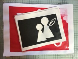
Another adventure in screen-printing today. I can see the appeal of the technique ... and I can see the frustrations too. My lack of attention to details and my need for perfection are completely at odds with this technique. Ugh. Love it ... frustrated by it.
Next week we move from masks to photo emulsion in our screen printing lessons. I will have a chance to try my hand at building layers too. (More exercises in frustration I expect ... but a very pleasant way to suffer!).
Woohoo class has resumed
Finally, after weeks of school holidays and public holidays, we finally got to go back to class. Let the printmaking begin!
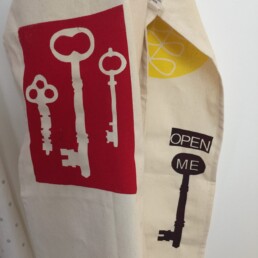
A new technique this week: screen printing. For many people this is something they have tried before but for me this was the first time I've tried it. A basic start - using masks/stencils as the means of blocking out the paint. The other part of the technique, photo emulsion, is scheduled for 2 weeks time.
This was a completely different thought process to the printmaking we've been doing up until now. It seemed ... more graphic? At least that is my sense of the art form. I'm more than OK with that. We printed on to an apron - a great way of creating something usable and a great way of reminding me to make art a part of my world.
Let the learning continue ...