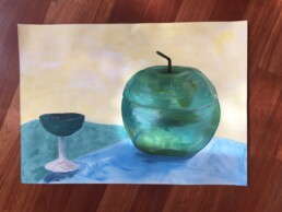
An anodised green apple
My painting class continues. This week it was blue and green week. Well, to be technically correct, it was yellow, blue, black and white week at my painting class.
We were challenged once again to paint the still life using a limited colour palette. I enjoyed the challenge. Interestingly, I found the oranges easier to mix. Turquoise proved to be a challenging colour (for me) to mix. Deborah decided in her wisdom to give us an anodised green apple to be the focal point of our still life. Actually, I am enjoying being pushed outside of my comfort zone. I would NEVER have attempted to paint an image of an anodised green apple. Equally I would NEVER painted an image of an anodised green apple on an A2 sized page.
I am being challenged ... and I love it.
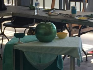
Here is the still life composition we were working from (you'll note the yellow bowl disappeared from my painting ... don't you just love creative licence!) :-)
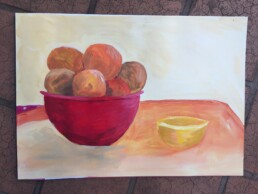
A bowl of oranges
My journey into painting continues. I have never really painted a still life. Most of my drawing and painting just falls from my pencil with no real reference to reality. So painting something so it looks like the object I am basing it on is an interesting challenge.
This week in my "Painting 1" class we were looking at red and yellow. We had to paint the still life set up by Deborah but limited in our paint choices ... red, yellow, white and black paint. No other options.
This is the first time I have painted in a studio using an easel. I must admit I did feel rather painterly!
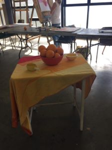
I still need to finish my painting ... there is some shading and finishing touches needed. Homework for this week. This is the scene we based our painting on:
Blue, red, yellow and brown
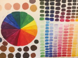
Over the years I have painted a few colour wheels. It is a good exercise to do every so often; to remind yourself of the colour choices and options available even with a limited set of paints.
I do have to admit that I have not often continued the exercise long enough to consider mixing brown. It is very easy just to reach for a tube of pre-mixed brown and not give it another thought. Reminding myself of the options to mix the exact colour I want was useful.
The colour mixing exercise was part of the first class of Painting 1 (a BIA class). Interestingly I have never actually taken a face-to-face painting class. I have mostly learned via online class. It was very enjoyable to be able to sit and paint with other like-minded people. People who equally appreciated the idea of blue and red and yellow makes brown.
So many projects (and that's a good thing ... mostly)
Does everyone rely on a "to-do" list? Perhaps not, I think. They are definitely not for everyone and I appreciate that, but for me my to-do list is an essential part of my day. Every day, all day.
It probably has something to do with the multitude of projects I have on the go at the moment. Most of them are self-imposed learning projects. I can't imagine not wanting to learn. I love a combination of formal, structured learning and also ad-hoc mini diversions. They all go on my to-do list. I intermingle work and learning and personal on the list. It is all important and I have learned that if it is not on the list it doesn't get done. Not because I didn't want to do it ... if it's not on the list I will have simply forgotten about it.
Right at the moment I am probably (i.e. definitely) over-committed to projects. I will need to revise my project list and also my personal sense of timing. When do I think I am going to find the time? What is important and what is just a super-awesome, wouldn't it be cool sort of project? Shiny balls, I call them (and I do love to follow the shiny ball).
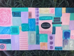
On the grid
All lined up in somewhat ordered lines ... well that's the intention for this journal page. My page is based on a lesson in Wanderlust 2017 (Week 19 - Kate Crane). The class focused on filling a grid composition with a colourful patchwork.
I really could spend some more time filling the sections on the grid with some squiggles and other decorative mark making. I have to admit, whilst usually being a big fan of zentangles, I am not in the right frame of mind to do repetitive mark making work at the moment. It could be something to do with the house being in holiday-mode; or it could just be that I have so many possible projects floating around in my mind I just can't bring myself to sit and work anymore on this one.
(My inability to commit to any one particular project is a whole other topic ... for whatever reason I am very much in the "follow the shiny ball" mindset right now).
Brush strokes and gel paste
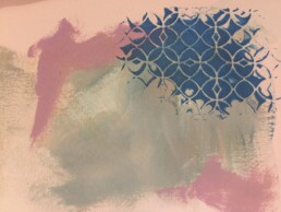
I keep an art journal. (Ok - full disclosure - I have 4 art journals on the go at any one time). I do have one of those journals set aside as a daily art journal. I learned long ago that daily creativity and journal keeping is important to me. I keep a record of the day-to-day ordinariness of my world in this journal. It is not for sharing (only because my day-to-day meanderings don't make for particularly interesting reading).
My daily art journal of choice at the moment is a Windsor and Newton A5 (approx 8"x6") visual water colour journal. I really like it. It is a soft covered book and the pages hold up well to a variety of treatments. Usually the pages are on the receiving end of leftover paint from other projects. I typically prep the page first and then progressively fill up the leftover space with my daily ramblings.
My next prepared page is a combination of random brush strokes using paint from 2 other projects and tinted gel paste pushed through a stencil. I was experimenting with how the tint might work with the gel paste. All that remains to be added is some of my words ...
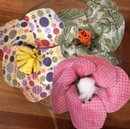
Paper flowers
And now for something completely different ... for two lovely hours carved out of the end-of-term madness I was lucky to learn the basics of paper flower making from the very lovely Jo Neville of Paper Couture fame. Jo was an excellent instructor and we finished the class with 3 handmade paper flowers.
Just quietly, I think I may need just a tiny bit more practice before I gain any skills in this craft. :-)
It did inspire me to find out more about paper flower making. There are some truly beautiful and inspirational bouquets made just from paper. I love it.
Enter Paynes Grey
I have been alternating between black and white prints and art work made using very bright colours. Yesterday as I learned how to make marks using screen printing, I played in a middle-ground. Paynes Grey is a such a great colour. It can be dark and intense; it can be muted and faded. It proved to be a great colour for layering on my screen printing experiments. I didn't produce particularly good looking work but I was most definitely learning how to make marks using screen printing techniques ... and how to create layer on layer on the prints.
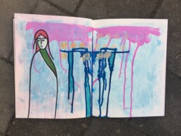
Not sure where this is headed
After a stint of black and white (mostly printmaking efforts) I felt the need to play with colour. This particular page is just a page of paint and an emerging girl. I am not entirely sure where I'm going with this. I don't have a plan and I don't want one. Sometimes it is so very nice just to put paint on the page and not be concerned with ideas and finished pages. Who knows, I may just cover the whole thing in gesso ... or not. :-)
Sometimes play is the best way to learn. (At the very least it is just pure fun).
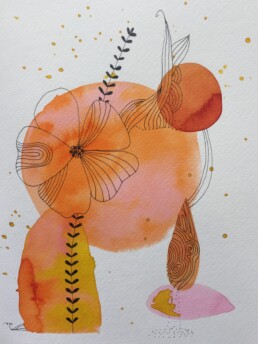
And now a splash of colour
Inspiration comes from everywhere ... or at least that is how it is supposed to work. Sometimes I am on a roll and ideas just flow. Sometimes I have moments where I sit down to create ... and ... nothing. No creativity, no ideas, no inspiration, just nothing. Those moments are frustrating.
There is a quote from Pablo Picasso that I particularly like ... "Inspiration exists, but it has to find you working".
So true.
This painting is inspired by a similar painting I found on Pinterest. This one is definitely based on a style I liked and tried to emulate. It worked; finishing this painting and being surrounded by water colours, paint brushes, and ink definitely helped with my creative mojo. Thank you Pinterest! And thank you Cecile Hud for your work.