Words to live by ...
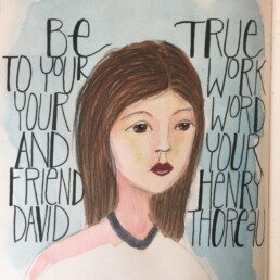
Continuing with my lessons in the Jane Davenport class, I am trying to add more words to my drawings. I have added a Thoreau quote this time rather than my own words. I think I would do the lettering differently next time but it's all part of the experimenting process. I used Jane's technique of painting a general head shape first and then back filling the features. I find that approach really relaxing ... so much fun to see who emerges from the initial background painting.
Hello facebook!
Inspired by some social media work I have been doing for an awesome baseball club ... (go Carina Redsox!), I decided I needed to better coordinate my own social media space. In addition to this blog, I use instagram, twitter, pinterest and up until now sort-of Facebook. I had my own unloved personal Facebook page but no space just for my art. But now, voila, I finally got around to creating a Danfeen Facebook page. It's early days yet, but I'm pleased I have applied my own social media advice and have started to get everything moving in the right direction! Woohoo.
Ink, watercolours and digital paint
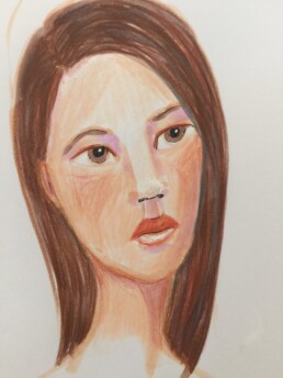
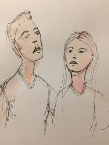
Jane's challenge in her Miss Quoted lesson this week was to start with a water colour "face" (or at least the underlayer) and then add pen and ink lines to create a face. I had fun trying this technique. Some of my faces worked wonderfully well and some, well some were an abysmal fail ...
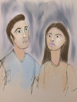
One of the sketches I did, really didn't work - I just didn't get the proportions right. But it did prompt me to take that sketch and use the Procreate app to see if I could improve on it. I'm not sure if I improved the sketch but it was an interesting exercise. I'll definitely try some more drawing like this.
This is the original watercolour and ink sketch:
Curly writing and ink-filled pens
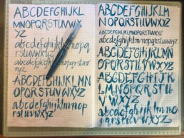
Writing as art ... and so it is, on so many levels. There is an art to the written word and there is an art to each of the individual letters. How wonderful to combine the art of the letter with the possibilities of an ink-filled pen. I have filled by pen with a turquoise blue Schmincke aerocolor ink and am on my way to filling up page after page of inky letters.
Inspired by the Jane Davenport and Joanne Sharpe Miss Quoted class, I am so pleased to be combining my love of words, ink and art. Happy place!
This month was ...
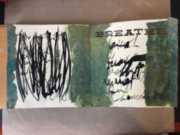
I am a little behind in some of the activity lessons for Wanderlust 2017, so it was wonderful to have a chance to get some painting and art journaling done this week. The prompt for the "Wanderlust Book" for 24 February was "this month was ... [insert 6 nouns]". I decided to think about the month of March as I created the page. My 6 nouns were ... hot, humid, busy, stressful, hopeful and harried. Lots of negative nouns - it was a tough month. So in a nod to those nouns, my page ended up being very messy, in colours I wouldn't normally gravitate to; olive green in particular is not one of my normal choices. Ultimately this is a page in an art journal and I'm OK with the mess. It truly does sum up my feelings towards March ...
Shades of orange and vibrant green
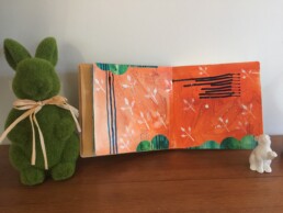
I have been continuing to enjoy the video lessons offered by Wanderlust 2017. The week 10 lesson by Alena Hennessy was another great learning experience. I love Alena's work - she makes intuitive painting seem so effortless. I struggling to add as many layers to my page as Alena does. I am in awe of her ability to add and layer and add and layer again.
I have made a start on my page inspired by the week 10 class. It is still a work-in-progress. It could use quite a few more layers and depth but I do like the shades of orange and the vibrant green sharing the same space. I have an overwhelming urge to add a face to the page ... but for the moment the page remains as a primed background.
That little part of my mind ...
I think my favourite thing about making art is that the process completely absorbs all my thinking. Often it really isn't about the finished product as much as the enjoyment of the thought process and the actual doing.
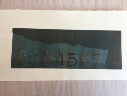
The print I created with the number is a great example of that. The actual print itself is meh but learning how to layer the print so that the numbers are separate to the blue line which is separate from the black background was totally absorbing.
When I am not creating there is always that little part of my mind mulling over my next project ... how can I take that technique and then do something different with it? What if I combine collagraphic technique as well and at the same time bring in some of the faces I like to draw ... ah the happy possibilities of creating! Take me to my happy place.
Circles, squares and dots
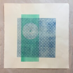
The lesson for printmaking this week was around chine colle and how that technique could be incorporated into our prints. The idea of adding layers to prints have given me a bunch of ideas to mull over and decide how I could use the technique next week. While I was doing some basic experimentation with chine colle, I also decided to experiment with printing using other objects including some old paper and stencils as a was of adding layers and depth.
My actual printing was pretty simple - two colours; incorporating circles, squares and dots. I chose to work reasonably big again. (Well ok, the overall size of the print was maybe 50cm x 50cm ... for me that is an enormous scale to work in!)
I really am enjoying printmaking. It is an intriguing way to work - layer on layer. It definitely appeals to my sense of order and logic :-)
Alphabet soup
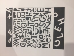
My adventures with printing continue - the focus with this piece was to discover how type (as a mask) could be used for a relief mono print. I like the print. It is big - around A2 in size. Quite striking with the black and white (I think so anyway).
Actually one of the really appealing parts of art for me is that my biggest decision in the case was whether to print in black or in purple. World-shaking decision, I know. Aaah, take me to my happy place!
Leaves, flowers and acrylic ink
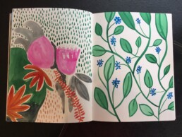
Yep, it's official. I am still thoroughly enjoying playing with acrylic inks. I'm enjoying painting leaves, making marks and experimenting with flowers with the acrylic inks. The inks are fun if not altogether forgiving. Once a mark is made, it stays ... and that's OK. That keeps the process interesting and challenging too.
